
Thursday, 25 April 2013
Copyright
Once i had completed my movie poster i had the realization that i was breaking copyright laws with my photo of Zooey Deschanel, because of this i could not use this photo. So i decided to change this to the photo of an attractive friend of mine, and it turned out just as i wanted.


I changed my image from the one above to the one below.
Monday, 22 April 2013
Development

This was my first version of the poster however i went on a sort of questionnaire discussing what people liked and disliked about the image. The main concern with this version was the writing was two small, crammed, and unequal to the other side.

I then went on to this version where i enlarged the writing, equalized the sides, and was overall better, however i felt 'Bradley and Jennifer' was two long and the character by A life's experiment ruined the main image.

I then fixed both of those problems, but i still felt their were problems, interview special on the left was to high, blast from the past was not bold enough and the writing underneath the subheadings was also not bold enough.

This was my final design completed, with me being entirely happy with it. The lettering is all bold, the advertisement is good and overall i feel this appeals to a potential buyer.
Other principles needed to be included
In order to make my front cover look most realistic, i need to include the little things. These are a bar code, issue number, price,website and date.

This was the bar code i decided to use. My issue number would be 29, the date would be April 2013,the price is £3.95 $5.99 is USE finally the website would be hybridonline.com
This was the bar code i decided to use. My issue number would be 29, the date would be April 2013,the price is £3.95 $5.99 is USE finally the website would be hybridonline.com
Sunday, 21 April 2013
Design Idea

Subheadings
I also felt it was extremely important to consider the subheading i was going to use, in order to exhibit the magazine. Here are some examples:


As is seen from these images although the picture is the main protagonist of what beholds, it is not all the magazine is displaying. Furthermore it helps to sell the magazine a whole lot more. As a potential buyer may dislike the movie its showing on the front but the subheadings could hold a degree of interest for the reader, helping selling the magazine. The subheadings i decided on were 'YOU CANT HANDLE THE TRUTH ! 101 Greatest movie one liners', 'Reviews on 2012', 'Interview Special Bradly and Jennifer discuss Silver Linnings', 'Free Movie Poster','The Beauty of Zooey Deschanel', 'Interview special with directer, The Blood of the exsperiment', '10% of next issue', 'Funny people, Will Ferrel and more!' and finally 'Blast from the past, review of Born on the Fourth of July'. These including images i feel will be a great selling point for my movie magazine.


Font and Name
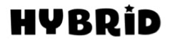
I decided to call my magazine 'Hybrid'. I chose to call my magazine this as it has a strong relation to the film industry in modern times, as the movie avatar was able to be filmed on a new highly technological camera which allows the director to delve into a deeper world of CGI, this camera is called the Hybrid camera. It also highlights the modern society of film and how things have changed. Finally i felt it was a great household name and the simple sound of the name add a refreshing sense to the mind overall selling the magazine. Once i decided on the name i had to decide on the font style, i want it to look both futuristic, modern, bold and hooking to a reader. These were the fonts i experimented with and found my final design:
 I first looked at this one as it, showed a certain degree of enjoyment in just the font, it was bold and represented something of a fashionable lifestyle. However it was no futuristic the slightest. It showed nothing of the new modern film industry and also it did not hook a potential buyer into buying the magazine. More over i felt it looked cheap and tacky, something i did want to do.
 I then looked at this font style and this was more to my taste. It was extremely modern, with the image of a technology from a simple font. Furthermore it is simplistic, which is always something that helps in many cases, as i feel trying to go over the top can spoil a product. Although i really liked this font i still felt it was not bold enough to hook someone to buy this product.
This was the third font i looked at which is evidently been as the same font used for the critically acclaimed movie 'Blade Runner'. This was much more bold and hooking as a font style, futuristic, and also a modern feel to it. However it still did not seem the correct title, it jut seemed boring, and needed a bit more.
 This next font was extremely close to what I wanted my title to be. It had everything i wanted, and most of all hooked a person to read on. Although this was so close to what i wanted i still wanted a bit more.
 I highly liked this next font it was slick, modern and held everything i wanted. However as a main title i felt it would not be as goo as it could be, but i did choose to use this font for my sub titles on the front of my movie magazine.

This was my final choice as the main title. It was my favourite a holds everything i want in my title. It is perfect, it hooks a potential buyer, is bold, modern, futuristic, and highlights what modern cinema is all about today. I was extremely happy with my final choice for my title.
This was the third font i looked at which is evidently been as the same font used for the critically acclaimed movie 'Blade Runner'. This was much more bold and hooking as a font style, futuristic, and also a modern feel to it. However it still did not seem the correct title, it jut seemed boring, and needed a bit more.
This was my final choice as the main title. It was my favourite a holds everything i want in my title. It is perfect, it hooks a potential buyer, is bold, modern, futuristic, and highlights what modern cinema is all about today. I was extremely happy with my final choice for my title.
Photo-Shoot


This was the photo-shoot, for both my poster and my magazine front cover. I thoroughly enjoyed this part, it was hard to decide how close we wanted the picture to be to the character. So i decided to take the pictures from different angles. getting closer and closer. The make up was a simple blood splatter which would match the context of my magazine sub heading. I tried to have a a sadistic look like a mad killer i.e Jack Nicholson in the Shinning or Christian Bale in America phycho
Titles and styles


I think it is extremely important to consider both the style of the font i choose and also the name of my magazine, as if it was to go into production it would appear on all of the magazines. I think it has to be both a statement but also a household name. Furthermore i want it to have a relation to the movie industry in some way, in the way premiere does. I want my font to be bold and also interlink like total film does and premiere.
Favorite front covers

I think this is a great example for the front cover of a movie magazine. I like how all the lettering in white turns into a sort of white mist to match the background image. The red is mirrored through out the front to match the colour of the main heading; Empire. As the front cover is supposed to sell the magazine i feel this does it very well as it shows the main movie it will be covering, its displays all the other movies they Will look at. Also it highlights other areas through the sub headings like "Tarantino the truth about Grindhouse".

I feel this is my favourite movie front cover i have ever seen for the Empire franchise, and the best at advertising the film. The first layer is that of the Joker the main villain in the Dark Night Rises, this is an amazing picture standing alone as it shows his features, highlights the movie with the contrast of clothes in a prison cell and shows the twisted nature of the character. Then looking at the colour scheme which also matches up perfectly with the of the character with the green and purple highlighting that of a sort of clown. The lettering is also perfect, "Meet the joker" matcher the character. At the top the famous batman symbol is advertised, and also all the sub heading highlight what else is going to occur n the magazine.

I also think this is another great example of a front cover. The main protagonist is that of the picture, which highlights the main cast of the movie, which is a star studied cast. The bottom also shows what else will entail in the magazine from previews to interviews. The colour scheme is very bright in order to contrast the movie which has a dark tone. However i feel that the should have been more sub headings in order to sell the magazine on a bigger scale.
Movie magazines
Empire is a British film magazine published
monthly by Bauer Consumer Media. From the first issue in July 1989, the
magazine was edited by Barry McIlheney and published by Emap. Bauer purchased Emap Consumer Media in early 2008. It is the biggest selling film magazine in Britain and is
also published in America, Australia, Turkey, Russia and Portugal. Empire
organizes the annual Empire Awards which were sponsored by Sony Ericsson, and from 2009 sponsored by Jameson. The awards are voted for by readers of the
magazine.


Total Film is a UK-based film magazine published 13
times a year (every four weeks) by Future Publishing. The magazine was launched
in 1997 and offers cinema, DVD and Blu-ray news, reviews and features. Total
Film is available both in print and interactive iPad editions. Each month,
Total Film provides a range of features, from spotlight interviews with actors
and directors, to making of and on-set pieces for new and future releases. Each
issue always includes the Total Film Interview, which is a six-page in-depth
chat with an actor or director, along with a critique of their body of work.


Premiere was an American and New York City-based
film magazine published by Hachette Filipacchi Media U.S., between the years
1987 and 2007. The original version of the magazine, Première, was
established in France in 1976 and is still being published there.
Neon was a British film magazine published monthly by Emap Consumer Media from December 1996 to February 1999. It attempted
to be a refreshing alternative to other UK film magazines such as Empire. Started in 1996, Neon included latest film news, previews, actor profiles,
interviews and contemporary movie profiles all written with a characteristic
sense of humor. Each issue featured A
Monthly Selection of Ten Favourite Things with a celebrity listing a
particular category for their ten favorite films, for example, James Ellroy in the July 1998 issue picked his ten favorite crime movies. What's your favourite Chevy Chase movie? featured the magazine asking various
celebrities from the Beastie Boys to Pamela Anderson and Tommy Lee their favorite Chase film. 100 Scenes From... was an irreverent
Top 100 list that parodied the notion of such lists. Blow Up was a 12-page insert included in the middle of every
issue that featured stills, promotional pictures of posters of movies and movie
stars. Another regular staple was called, Flashback, a detailed, oral history of a classic movie with
comments culled from cuttings and original interviews with cast and crew
members. This format was later copied by another UK film periodical, Hotdog Magazine. Finally, Graham Linehan's Filmgoer's
Companion took a satirical
look at the entertainment industry. Neon
also championed lesser known films like Mike Leigh's Naked and ran in-depth profiles of films such
as Steven Soderbergh's Out of Sight and Fear and Loathing in Las Vegas. Unfortunately, the magazine did not make a
profit and after the original editor left, it took a more commercial direction.
The circulation numbers diminished and Neon
was eventually cancelled in February 1999.


Thursday, 18 April 2013

Tuesday, 16 April 2013
Change
This was my original concept for the bottom of my movie poster. However having a closer look i realised some errors. The date was the date of my birth, me getting confused so i decided to change it back. Also the PG-13 sign is an american logo, and furthermore this is an 18 movie so i changed this and also included a QR code which would link to this blog.
Monday, 15 April 2013
Font

I looked at a variety of different fonts that would be best suitable for my media Product. The first one i chose was the one above which was used for The Lord of the Rings, and i do really like this one. Its hard edges may be a representation of the movie itself. However the letter A near the Letter L i feel is to close and looks odd in a sense, although i do like it i don't feel it would be best suitable for my product.

At first i experimented with the fact of putting the word life of different font, to give it a different representation compared to the rest of the lettering however i chose to scrap this idea as when its put together with the rest of the title, it does not work as a whole.


I came to my final decision of this title, the reason being it was both simplistic but also in your face, taking no authority over the image. It also has sharp edges with clear representation of the movie. I felt this was the ideal choice for my movie poster.
Tag line
In many movie posters 'tag lines' are used normally something extremely relevant to the movie. This can portray the conventions and genre of the movie but it can also help sell the movie. Because of this I wanted to include my own tag line, to highlight the genre of my movie and also put a greater emphasis on the main character. The tag line I have chosen which is also featured in my trailer is "I have a rendezvous with death, I shall not fail the rendezvous" and "What is Real?". I did go through many other ideas before i came to the main choice for example: "How far would you got protect the dead", "Look death in the eye, and grit your teeth", "There is a devil within everyone, and he as just been freed" and "Family man? Insane? Killer? Or Cleansing the system". I Finally chose my last one for the simple of the reason it showed the movie in its best, added a sadistic side and is featured in my trailer.These are some great examples of posters with tag lines:


Subscribe to:
Comments (Atom)