I decided to call my magazine 'Hybrid'. I chose to call my magazine this as it has a strong relation to the film industry in modern times, as the movie avatar was able to be filmed on a new highly technological camera which allows the director to delve into a deeper world of CGI, this camera is called the Hybrid camera. It also highlights the modern society of film and how things have changed. Finally i felt it was a great household name and the simple sound of the name add a refreshing sense to the mind overall selling the magazine. Once i decided on the name i had to decide on the font style, i want it to look both futuristic, modern, bold and hooking to a reader. These were the fonts i experimented with and found my final design:
I first looked at this one as it, showed a certain degree of enjoyment in just the font, it was bold and represented something of a fashionable lifestyle. However it was no futuristic the slightest. It showed nothing of the new modern film industry and also it did not hook a potential buyer into buying the magazine. More over i felt it looked cheap and tacky, something i did want to do.
I then looked at this font style and this was more to my taste. It was extremely modern, with the image of a technology from a simple font. Furthermore it is simplistic, which is always something that helps in many cases, as i feel trying to go over the top can spoil a product. Although i really liked this font i still felt it was not bold enough to hook someone to buy this product.
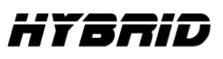
This was the third font i looked at which is evidently been as the same font used for the critically acclaimed movie 'Blade Runner'. This was much more bold and hooking as a font style, futuristic, and also a modern feel to it. However it still did not seem the correct title, it jut seemed boring, and needed a bit more.
This next font was extremely close to what I wanted my title to be. It had everything i wanted, and most of all hooked a person to read on. Although this was so close to what i wanted i still wanted a bit more.
I highly liked this next font it was slick, modern and held everything i wanted. However as a main title i felt it would not be as goo as it could be, but i did choose to use this font for my sub titles on the front of my movie magazine.
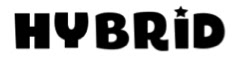
This was my final choice as the main title. It was my favourite a holds everything i want in my title. It is perfect, it hooks a potential buyer, is bold, modern, futuristic, and highlights what modern cinema is all about today. I was extremely happy with my final choice for my title.


No comments:
Post a Comment